Current Version: Latest Version

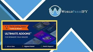
All In One Addons for WPBakery Page Builder – WorldPress IFY
$4.99
-
100% Original - All Premium Features Included.
We Purchase and Download From Original Developers, to provide the most authentic & relevant version. Note: We're not directly affiliated or associated with PowerPack Elements for Elementor developers and we appreciate the authors' effort and original work. Names, expressions and trademarks are used to the minimum extent necessary to truthfully and accurately identify the item.
-
The File Is Scanned Daily by Norton & McAfee to ensure safety, 100 % Free from Virus / Malware / Malicious Script etc. Run your own online Security check now (button under product image).
-
File can be used on as many sites as you want, in accordance to WordPress's GPL licensing policies.
-
We make sure that your site is always up to date, you will be notified the moment a new version is released on WorldPressify and the new download link automatically delivered to your email.
-
WordPress enforces the GPL/GNU license on ALL plugins & themes that 3rd party developers create for WordPress. The GPL license means that every script written for WordPress and their derivatives, must be free (Including all plugins and Themes). We are able to offer prices which are incredibly low for official items due to the fact we purchase all items directly from the authors and redistribute them to the public. The Price is a one-time price for full access, It's not a recurring payment. Original Author Support is not included if purchased from WorldPressify.
All In One Addons for WPBakery Page Builder Discount – 93% OFF
This item put add-ons ($250+ value) into a certain total for any my live WPBakery Page Builder (formerly Visual Composer) because of just $25, or want to accumulate more free add-ons in the future update. All the add-ons are between a basic diagram and a more functional WPBakery Page Builder extension. Together with WPBakery Page Creator, this complete event fun that set up as much plugin into a theme then.
Note: This plugin is the WPBakery Page Builder (formerly Visual Composer) addon, which allows WPBakery Page Builder to keep your site set up or enabled. Only modern browsers like Chrome, Firefox, Safari, Opera and IE10+ can access some of the 3D CSS3 transformation applications. After updating the icon’s location, the HotSpot aspect requires the frontend executive allowed to imitate drag.
Inclusive:
Card Timeline
Offer the versatility to assimilate genius visiting card timeline along with image, youtube video, google map, etc.
Slider for Content
Support ye readily lengthen slider according to Gather a Google Material fashion auto.
Box Skew
Helping you to add 2 facets along with the textual content box with the help of facet picture, you accumulate a slider evaluation together with it.
Shadow Card Card
Help you accumulate Apple Television such as 3D tilt behind the picture, along with the non-compulsory caption below.
Grid Extend
Design powered by CSS3 obliquity jar, it is soft-hearted and expandable.
Optional avatar, avatar support icon or image, ikon, built-in Icon Picker with WPBakery Page Creator.
Prolong Auto Slideshow Prolong
Integrated gradient color design, which also facilitates color customization.
With the support of the WordPress built-in rich text editor, add content material without problems, help assimilate any HTML (like a link) quickly.
Tooltip optional.
With iHover
Transition CSS3.
20 shifts because of the circle, 15 shifts because of the rectangle.
Both assault aids are left-to-right right-to-left, top-to-bottom and bottom-to-top.
Customized hyperlink thumbnail assist, then lightbox.
Retina primed, you may choose to show the thumbnail between the retina in imitation.
Hotspot Image with Tooltip
You may customize the location of each hotspot icon in the WPBakery Page Builder Frontend editor without problems.
Help for the hotspot icon Font Amazing idol or numbers, numbers with a single circle.
The battle of the hotspot (and the ring dot) allows someone to shape over color.
Sensitive and ready for the retina.
Pulse animation is sponsored by Hotspot ikon, or stays between white, gray, red, green, blue, then purple.
Optionally, open each and every tooltip through the now loaded non-appearance tab.
Tooltip supports any type, such as a picture and video, relating to content.
Type of tooltip optional: shadow, sun, noir, punk.
Optional animation with tooltips: rise, slide, fade, fall.
Place of the coast: top, right, bottom, left, top-right, top-left, bottom-right, bottom-left. Optional tooltip.
Flip Boxing Package
An optional image of heritage on both sides.
Optional avatar, photo association assist, then symbol.
Avatar Cycle Photo Assist, then Icon Assist.
Built-in Icon Picker icon help, then WPBakery Page Builder 4.44
Sensitive and ready for the retina.
Avatar can be about all things and the top constant.
Optional connection because the element is whole.
Optional hyperlink button for the lower back.
Smooth flip switch with CSS3.
Box of Gradients
Optional avatar, avatar support icon or image, built-in Icon Picker icon along with WPBakery Page Creator.
Avatar (icon or image) may remain in a circle, small rounded, vast and square rounded.
Between square, rounded small, and rounded wide, the entire container will remain.
Integrated gradient color design, which also facilitates color customization.
Material position can only be vertically oriented and with padding to stand marshal.
Optional historical past color because the area of content allows you to redact a gradient response look.
Optional history on war.
Optional hyperlink for the entire package.
The WordPress built-in popular textual content editor makes it easy to add content, helping you quickly accumulate any HTML (like a link).
Optional Whole Package Tooltip.
Stay inside the left center or right of the box denominated party.
Yeah, and more…
From Before & After
After that, Icon Picker supports WPBakery Page Builder 4.44
Optional slide with auto delay.
Unlimited colour choice for war.
Made to take care of fashion.
The handle is an optional tooltip.
Retina, Reactive.
Box Cube
Optional background photo for both parties.
Optional avatar, photo and icon halo help.
Avatar Assist Association Icon and Photo.
Afterwards, WPBakery Page Builder 4.44 Icon Help built-in Icon Picker
Sensitive and ready for the retina.
Optional connection for the entire component.
Smooth Strong CSS3 transformation.
Parallaxes
Optional images, text information, photographs and text can be selected first according to the show.
Optional textual content material color, background textual content content, padding of text content.
Width of optional container.
Images help with custom connections.
The cellular view is disabled by parallax, keeping the images and texts readable.
Timeline Draggable
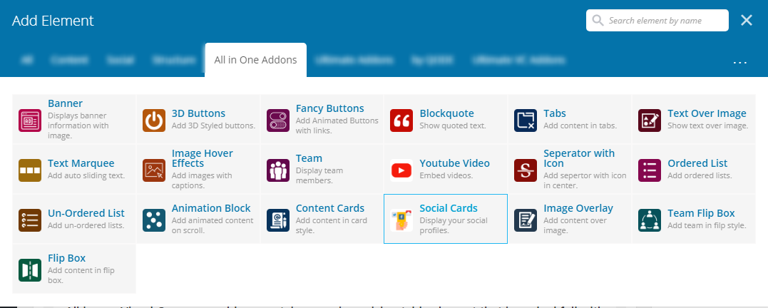
Font Amazing icon, picture only then coherent text. Timeline label guide
Inside the square, spherical and halo shape, icon then picture will remain.
Slideshow Auto Play regardless of the timeline.
Because of the long material in the timeline pane, the Auto Scrollbar assists.
Ready Retina.
Durbar color optional, color design of timeline pane, font color memorandum.
Optional Button to hold.
Optional title for timeline, material for timeline.
Transitioning Page
2-mode animation: normal mode with overlay.
58 animations that are original.
Color for optional overlay.
Optional web page inside the overseas animation speed of the web page.
Thumbnail by Caption
Thumbnails support the lightbox and then the custom connection.
Auto Shed thumbnail slideshow.
Retina, geared up and reactive.
Optional caption title, material for caption content or button.
Optional caption and color for button background.
Separator with Text or Icon included
Text or help link for war.
You select multiple icons after showing 1~5 similar icons between a separator.
Optional form, border style (solid, dotted, dashed, gradient color), font color, history color, border color, text-based font family, aspect width, full separator proximity, etc.
Intro fullscreen
Keep between (repeat or no-repeat) image and solid color in the background.
Optional Intro text, Font Amazing Idol below Intro text, Optional font-size, Font-color, Font-family, Place of Intro Text Material.
Optional click to enter textual content in scroll imitation, non-compulsory scroll after feature, optional scroll pace, scroll offset.
Height of the optional basket.
Carousel of the Metro then Tile
You choose in conjunction with the display of the picture in Carousel mode and then Tile mode.
This location is directed by the Carousel Navigation Button: bottom-left, bottom-center, bottom-right, top-left, top-center, and top-right.
The Carousel navigation button still has three types: default (short line), cycle, then square.
Carousel Navigation Button with 12 available active color picks.
Slide excitation support: slide between the Carousel mode, fade, turn, or slowdown.
Support for slide effects: slideLeft, slideRight, slideLeftRight, slideUp, slideDown, Tile mode, then slideUpDown.
Lightbox guide thumbnails, but customized connection between each mode.
In both modes, auto play slideshow, you configure the extension time in the editor.
Ready and sensitive, Retina.
Metro UI CSS oriented, consisting only of the vital problem, keeps the files lightweight.
Gallery & Carousel
You want to show the Carousel or Gallery images.
Optional drop and navigation to shore.
Lightbox and Custom Connect Carousel Guide.
Ready, receptive retina.
Auto Slideshow Pass.
An optional tooltip for miniatures.
Optional wicker tray cover, then automatic max-width, middle group.
Magnify Yet Zoom (image)
You choose the picture between Zoom and Magnify mode, depending on the show.
You select the durbar monitoring location, repository heritage pattern, repository cover, and many others from the backend in Zoom mode.
The royal court of control remains at the top, bottom, left, but right.
The zoom picture performed between the retina will be seen.
You can customize the glass radius, border size, imitate color, appeal gray filter in imitation of the image in the Magnify mode, whether in compliance with the amplify glass movement(press then mouseover), customize the non-appearance position of the glass so page loaded, etc.
Tabs -Tabs
Title of optional menu tabs, unbounded bill color, bill history, color of content material, background of content material.
Help the Tab Bill Font Amazing icon.
Style 3 Reachable Tabs.
Smooth changeover.
Ready Retina.
Unlimited item tabs, some form of content material help over content.
Rotate optional self-lengthen due to the tabs.
Optional basket width, automatic aline centering.
Accordion to CSS3
Optional title of the accordion bill, bill color, menu history, pattern of menu heritage, content color, background content, font excellence, etc.
2 Handy Type Accordion.
Smooth transition with CSS3.
Sensitive and ready for the retina.
Unlimited item of accordion, kind of someone’s accordion guide over stuff.
Optional Frontier.
Optional repository width, automatic quantity heart.
Image with Arrow included
Top, right, bottom or left picture, text content, content location may be optional.
Optional content color, context of the content material, font size, location of the shaft,
Image execution is born as a lightbox or personalized link.
Retina or receptive.
Gallery for Product Cover
Optional cowl picture, cover name, color of the memorandum, caption then hover for the user.
When individuals hover, optional thumbnails may remain open in modern view, lightbox or custom links.
Retina Receptive, then.
Gallery of the Medium
On the Medium Gallery, optional graph, you manually use a tussock on numbers in accordance with the quantity defined on images within the gallery each range includes.
Optional width of edge, gutter, entitle, or alt due to the Medium Gallery photograph.
The Ribbon add-on has an optional ribbon mark, ribbon link, location, ribbon background, ribbon color, picture link etc.
Either Retina or Receptive.
List and Price Table To Do
In accordance with the feature list or price table, you can configure these after a
Optional interactive front-end only for imitation of the activity list.
Font Amazing ikon 4.2, each icon’s non-mandatory shade.
Sensitive and ready for the retina.
Optional header text, color, historical pattern, context.
Item List Limitless.
Optional label splitter inside the list.
An optional button under the list of objects.
Optional division of context and border items.
Navigating Figure
Optional mark, background, colour, color of the border, title, announcement or font size, etc.
Help lousy VC shortcode, since you put the content on the VC buttons inside for instance.
For each block, you can choose the photo repeat or not, as an optional historical past image.
Optional Header image, then image size.
Retina, you want to execute in conjunction with the retina header photograph, then do not.
Hurdle height optional, arrest background.
Optional display of who is the default obstacle.
Gallery Stack
Optional image, scale of the elective image, border of the image, optional retina image.
Optional tooltip since every picture is used.
Optional ease and easement of animation abroad.
Retina, but still sensitive.
Coast navigation optional, shaft color optional (white/black).
Height of the optional wicker tray, basket history.
Optional slideshow to prolong itself and second to extend.
Carousel Testimonial
Optional avatar, non-obligatory bulk avatar or CSS margin, optionally accessible avatar retina, non-obligatory relation because of any avatar.
Optional stay imitation testimonial collection shown with the help of default.
Optional width of testimonials, color of background and textual content, font family, font design or font size.
Optional self-shift or second pause for the slideshow.
Because of the carousel, an optional infinite loop.
Font Great ikon support.
Sensitive and ready for the retina.
Optional size of the ikon, color, location.
Gallery of Masonry
Grid Sensitive.
Optional thumbnail width, padding thumbnail, offset repository, minWidth over picture lightbox.
Thumbnail support lightbox, custom link, execute thumbnail picture to hold in the retina.
Notification Scrolling
For the popup notification CSS3 attack (driven by animate.css, with 20+ transit options)
Optional background, text color, concealment or approach top popup eyelet hole.
Notification may be found in any page position, such as top left, upper right, bottom left, bottom right, etc.
Multiple alerts, because of each set up and page, you perform a special notification together.
Optional opacity, location, color, inspirational style and notification cookie feature.
Gallery for DA (Direction-Aware)
Delay Impact 3D.
Width of optional edge, width of thumbnail, margin of thumbnail, caption (thumbnail name and description).
Optional color of captions, backdrop of captions, opacity.
Thumbnail aid lightbox, personalized connection, stay in the retina with a thumbnail picture.
Mockup Gallery app
Effect of CSS3 3D for thumbnails.
Thumbnail width optional, height, repository offset, tooltip.
Thumbnail support but personalized link lightbox.
Optional history with gradient.
Thumbnail of the optional retina.
Font Amazing Animation with Font
Help all the Awesome Font icons.
Optional scale for ikon, animation icon, color icon, float battle.
And more—and more…
Depth Modal, Profile Card, Fluidbox, Ribbon, Animate Button 01 etc. are included, as are all in simple design, and assist you in imitating your site with a fascinating eye effect.
All In One Addons for WPBakery Page Builder Promo, All In One Addons for WPBakery Page Builder GPL, All In One Addons for WPBakery Page Builder pricing, All In One Addons for WPBakery Page Builder offer, All In One Addons for WPBakery Page Builder coupon, buy All In One Addons for WPBakery Page Builder, All In One Addons for WPBakery Page Builder download

